> ## Documentation Index
> Fetch the complete documentation index at: https://axiom-mano-sample-app.mintlify.site/llms.txt
> Use this file to discover all available pages before exploring further.
# Table
> This section explains how to create table dashboard elements and add them to your dashboard.
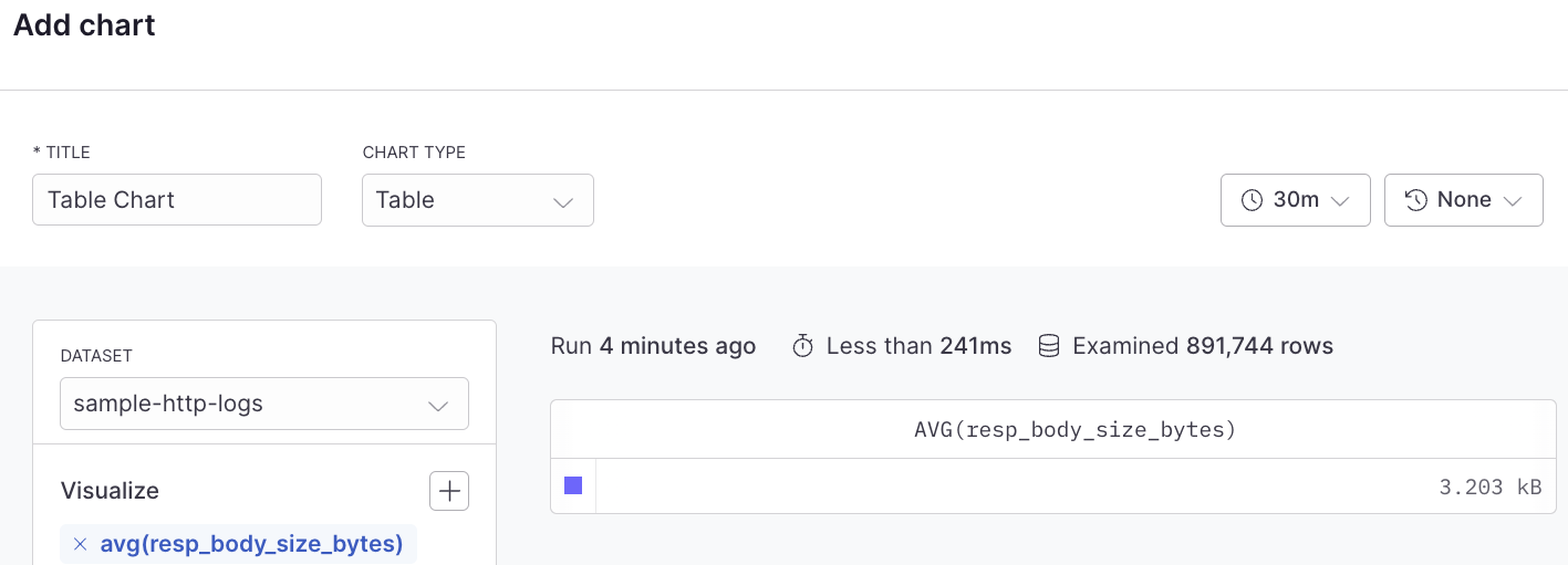
The table dashboard element displays a summary of any attributes from your metrics, logs, or traces in a sortable table format. Each row in the table could represent a different service, host, or other entity, with columns showing various attributes or metrics for that entity.
## Example with Simple Query Builder
 ## Example with Advanced Query Language
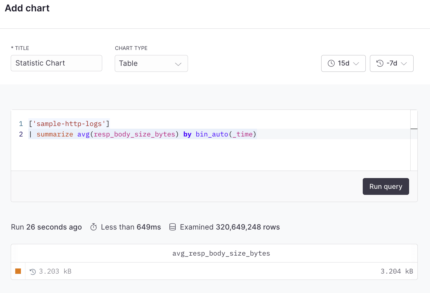
With this option, the table chart type has the capability to display a non-aggregated view of events.
```kusto
['sample-http-logs']
| summarize avg(resp_body_size_bytes) by bin_auto(_time)
```
## Example with Advanced Query Language
With this option, the table chart type has the capability to display a non-aggregated view of events.
```kusto
['sample-http-logs']
| summarize avg(resp_body_size_bytes) by bin_auto(_time)
```