> ## Documentation Index
> Fetch the complete documentation index at: https://axiom-mano-sample-app.mintlify.site/llms.txt
> Use this file to discover all available pages before exploring further.
# Time series
> This section explains how to create time series dashboard elements and add them to your dashboard.
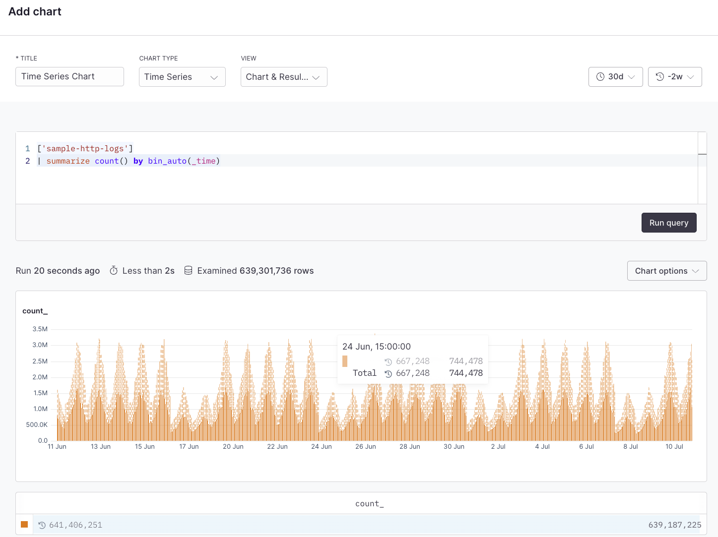
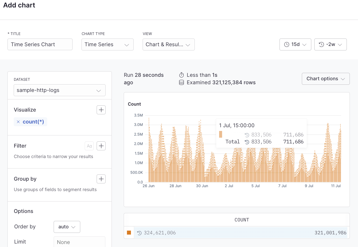
Time series charts show the change in your data over time which can help identify infrastructure issues, spikes, or dips in the data. This can be a simple line chart, an area chart, or a bar chart. A time series chart might be used to show the change in the volume of log events, error rates, latency, or other time-sensitive data.
## Example with Simple Query Builder
 ## Example with Advanced Query Language
```kusto
['sample-http-logs']
| summarize count() by bin_auto(_time)
```
## Example with Advanced Query Language
```kusto
['sample-http-logs']
| summarize count() by bin_auto(_time)
```